
*Small updates to article added December 2021 to provide more information.
Using data analytics to rank sports teams or stars is not a new idea. Nevertheless there haven’t been many genuine attempts at using models to rank F1 drivers. Below I give details of my attempt. It is in no way meant as a definitive guide, as all models require assumptions and inflexible rules to remain objective. However, I believe there is enough meat to it to be considered useful in assessing F1 drivers.
What is the model?
Put simply, the model takes 5 things into account:
- The percentage of the points that two team-mates score relative to each other each year.
- The fraction of the year they spent as team mates.
- The points they scored compared to the maximum points available.
- If a driver scores a very small amount of points (or no points at all), their non-points finishes are also taken into account.
- The drivers experience and age are also accounted for.
The first two are relatively simple to understand why they’re needed, but let’s look a bit deeper at how the first one works. Each driver is given a single number, which roughly translates to “how good that driver is”. Let’s say, as an example, that Verstappen = 1,000 and Pérez = 700. This means that, as teammates (ignoring the addition adjustments of points 3, 4 & 5 above) the model expects Pérez to score 7 points for every 10 Verstappen scores, or 41% of Red Bull’s points.
Obviously, the exact ratio of points scored varies year-to-year, so each year will generate some kind of error. If Pérez only scores 35% of Verstappen’s points the next year, the model will adjust the numbers to reflect this. The aim is to minimise the total error for every driver. Lowering Pérez’s score will increase his error for other seasons (as it will have previously been calibrated to minimise the errors), and the same will apply to boosting Verstappen’s score. As such, they’ll be a compromise, and perhaps Verstappen will end up with a score of 1040 and Pérez 675, which lowers the expected percentage from 41% to 39%. You may notice that Verstappen’s score has increased more then Pérez’s score decreased. There are 2 reasons for this. Firstly, Pérez is a more experienced driver, so the results of 1 year are less important in how the model views his overall career. Secondly, Verstappen has had several inexperienced teammates. This has an effect because it’s the total error that matters. Increasing Verstappen’s score will increase the score of every other teammate he’s had, and their scores are more inclined to change than Pérez’s teammates because their period as teammates to Verstappen represents a larger fraction of their career.
The third is a modifier to allow different cars to be compared and to give weighting to the results. A comparison based on just a few points scored in the year is less reliable than a comparison based on many points, because the smaller the number of points the more chance there is for it to be stronger affected by a lucky result. Due to this, teammate match ups with lower points are treated as less reliable. This adjustment is logarithmic, meaning that after just a handful of points scored the reliability improves considerably. As an example of how powerful this effect is, Button’s championship winning 2009 season is given about twice the weight of his disastrous 2007 and 2008 campaigns.
There is also another adjustment made due to the points scored compared to the total amount of points on offer. This is done to take into account how the points ratio between teammates is affected by how competitive the car is. It is much easier to gain a high percentage of points if fewer points are scored. A teammate score of 2-1 doesn’t necessarily imply that the higher scoring driver is fundamentally superior, whereas a score of 400-200 does. As the default for the model is to treat the two the same (i.e. the higher scoring driver got 67% of the team’s points), the adjustment converts each percentage to a predicted score if they were driving a competitive car. I have arbitrarily chosen the 2020 Mercedes as a reference point.
The conversion itself is a little complicated, but as an example, the model predicts that a score of 2-1 in 2020 (as the Haas cars scored) is equivalent to the lead driver scoring 54% of the points if they were in a Mercedes, as opposed to 67%. However, the model does not trust this result very much, due to the low score. The result in the case of the Haas drivers is that Magnussen is considered to be, on average, a slightly superior driver to Grosjean on average, despite being outscored last year. This is due to the fact that their other years as teammates, as well as comparisons with other teammates, are taken into account. (Note that this example ignores the small adjustment due to non-points finishes, but the fundamental point remains).
One way to understand the reasoning behind these adjustments for car performance is by studying the graph below, which shows all the (full season) teammate points distributions for the past couple of decades:
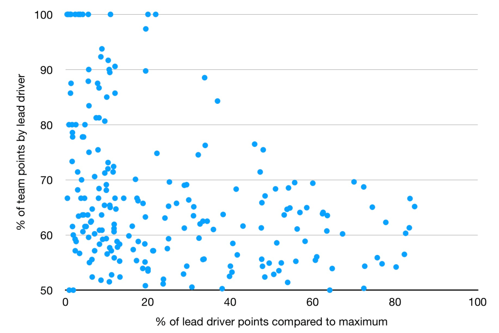
The y-axis shows the percentage of the team’s points that the highest scoring driver obtains, whilst the x-axis shows the highest scoring driver’s points relative to the maximum points available (i.e. winning every race). In essence the y-axis shows how dominant the lead driver is within a team, whereas the x-axis is an indicator of how competitive the car is. You can see that the data is much more spread out for less competitive cars. This is expected of course. A driver might score 3 points to a teammate’s 0 (which would be top left of the graph) but you would not expect them ever to score 300 to 0 (top right of the graph, which is noticeably empty). It is this variance that the model attempts to correct for, because the basic input for data is just he percentage of points scored, and matchups that end in scores of 3-0 and 300-0 would both be considered to be the same (100%-0% of points scored) before any adjustments are made.
Finally, there is a correction made for experience and old age. Drivers typically underperform in their first couple of years relative to the rest of their career, due to a lack of experience. The model measures the average underperformance and lowers expectations to correct for this. The first couple of years of a career can be a bit unstable, with some drivers (e.g. Hamilton) hitting their form right away. whilst others (e.g. Nico Rosberg or Jenson Button) taking longer to reach their peak. This is probably due to a number of factors, including pre-F1 racing experience and amount of F1 testing. This means the correction is good as an average, but is non-perfect for any individual driver. However, it still serves as a good approximation.
The correction for age is similar. There is a small adjustment made for drivers over the age of 36, with the adjustment getting larger for every subsequent year.
What data is included?
The model includes all teammate comparisons since 1950. Positions of non-points finishes are only considered when points scores are below a certain threshold. (The exact threshold changes year-to-year, but for 2020 it was 13 points, meaning that Alfa Romeo, Haas and Williams all qualified for non-points finishes to be considered.)
No explicit adjustments are made for DNFs, regardless of cause. There are pros and cons to this approach, but given that F1 drivers and teams are ranked for the yearly championships based solely on points, it is a reasonable way of assessing things. I believe it is particularly apt for the modern era, due to the large number of races and high reliability.
Yearly scores
The basic output of the model is an average score for a driver over their entire F1 career relative to other drivers. However, obtaining a yearly score for drivers is also desirable, as it allows for analysis on driver’s form and team competitiveness. This is done by comparing the predicted result by the model to the actual result, and adjusting the driver’s average score to a specific yearly score. The model treats discrepancies as mostly occurring from driver’s underachieving rather than overachieving. Therefore, if a weaker driver beats a stronger teammate, the model mostly interprets this as the stronger driver having a poor year.
Note that the fundamental metric for performance is points scored relative to a teammate, so a stronger year for one driver will naturally be interpreted as a weaker year for their teammate. This assumption is imperfect, as it does not allow for both teammates to have above average years, but it keeps the model simple and generally returns sensible results.
Thanks for reading, please subscribe to see more content!

Pingback: Who's The Greatest F1 Driver Of Each Era? - F1 Analysis
Pingback: F1 2024 Mathematical Driver Rankings - F1 Analysis
Pingback: 2025 F1 Driver Predictions - F1 Analysis
Pingback: F1 2025 Mid-Season Mathematical Driver Rankings - F1 Analysis
Pingback: 2026 F1 Driver Predictions | F1 Analysis
Care to share exactly what the analysis is?
You enjoy creating these analysis posts and I think that’s great; I would encourage you to properly present your methodology and statistical analysis such that it can be assessed by others.
LikeLike